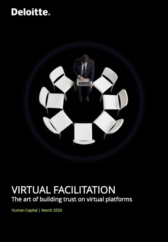
A white man with short brown hair wearing a black suit and tie sits in a small circle of white chairs that would be uncomfortably close if occupied by others. Although light illuminates him and the empty chairs, darkness surrounds him. There is no light reflecting off the ground as if the man and his chairs were suspended in deep space. The man is slightly hunched over, with his knees closed and bent at a 90-degree angle, his feet neatly placed on the invisible plane below. His face is obscured as he stares into the computer on his lap, scrolling with his right hand while holding onto the screen with his left. Despite the darkness slowly consuming him, he remains seated, staring into the screen, as if this is all he had ever done and all he will ever do.

March 2020: The COVID-19 pandemic is about to unfold. Deloitte publishes a PDF titled 'VIRTUAL FACILITATION—The art of building trust on virtual platforms using Microsoft, PowerPoint, for Office 365. The A4 PDF has 17 pages but only because it's designed like a slide deck. The font size consistently hovers somewhere between 20, 20.1, and 23pt. It's mostly bullets, tables, and flow charts like step-by-step instructions on the do's and don'ts of digital video conferencing and the latest technology to spice up your digital session. Colors are limited to Deloitte Green (Pantone 368), black, gray, and white. On page 15 the font switches from Open Sans to Verdana for no particular reason. The PDF consistently emphasizes how 'virtual' this new normal is, perhaps this reflects our collective disbelief that 'this is actually happening'.
Documents like this one are ubiquitous. As corporate communication, these documents are part of the canon of gray literature—publicly available, but private through obscurity. Deeply nested in the directories websites, attached to emails, rarely printed, or if so, likely to be forgotten in a pile of paper; these documents need to be actively searched for. And now that the pandemic is practically over it is only a matter of time before the COVID PDF will start to disappear from the servers it is currently hosted on. Still, these PDFs document (in the truest sense of the word) that the pandemic happened; not that anyone needs proof of it.
They do so in a way that perhaps can be described as extra gray. Although all of these PDFs address how drastically the pandemic has transformed the way we work, they might as well be instructing us on the correct use of copy paper. They respond to the pandemic but are entirely void of it. This is (of course) by design. They are not meant to reflect its severity. As corporate speech, their main purpose is to keep the spirits high and business intact. But because these documents fall, at least implicitly, under the subcategory of crisis communication they had to deal with the reality that there was indeed a pandemic.
Perhaps that reality could also be best described as extra gray. Besides the continuous doom cycle, there was relatively little happening outside the screen for the non or less essential worker. The horror of the lockdown didn't just manifest in death, anxiety, and conspiracy theories. Spent enough time in isolation, bombarded with any form of excitement and everything subsides into dullness, a dullness that came with loneliness and lethargy. For a long time, the pandemic felt extraordinarily boring, extraordinarily gray. So boring that after everything has been binged after all walks have been taken, and all bread has been baked, all that was left to do was work, even if it was just out of boredom.
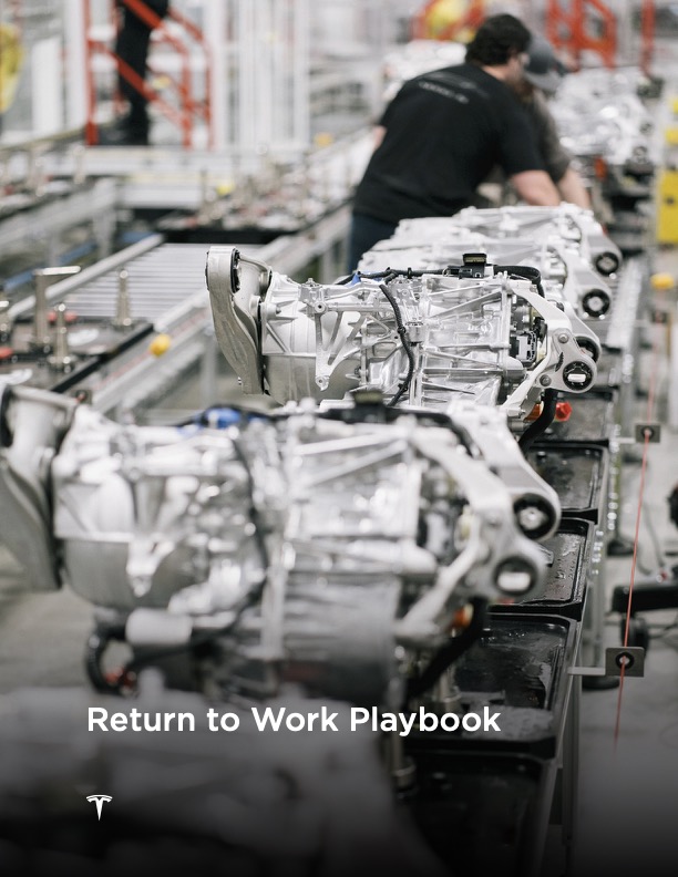
The sound of whirring machines and clanging metal is filling the air. We are inside a Tesla factory. The bright and clean environment is a testament to the cutting-edge technology that drives the company's success. The camera zooms in on an assembly line, where rows of gleaming cast aluminum engines are meticulously crafted by robotic arms. In the background, two workers hunch over one of the engines, their bodies blurred by the shallow depth of field. Their movements are swift and precise as they work in harmony with the machines to create the ultimate driving experience. Welcome to the ‘Return to Work Playbook’ by Tesla.

As of May 2021, things are already looking a bit more hopeful and the virus seemed to be taking a break. Back to work! The Return to Work Playbook has 38 pages and was made in Adobe InDesign 15.0 on a Mac. The PDF follows a consistent corporate identity, opening with an introduction followed by a message from the leadership. It's packed with bullet points, charts, and regulations that outline hygiene and safety protocols at work. Each chapter is separated by a full-bleed stock photo. My favorite moment here is the Cybertruck sandwiched between two concrete slabs, accompanied by the headline 'Control Access.'
Boredom is at odds with the necessary optimism and excitement of the corporation. Overzealous enthusiasm is perhaps as old as the corporation itself. Stock photography, stale copy, and the ambient presence of the corporate spirit has soaked into every imaginable surface. It's normal if not mandatory. But the more dramatic the real world becomes the more absurd and distorted the corporate imaginary appears. It's common wisdom that automation and emotion don't go that well together. But corporations need to communicate efficiently. This is the corporate crisis communications conundrum. It makes CEOs like Braden Wallake cry and the Vanderbilt University use Chat GPT to address mass shootings.
The utter banality of the subject matter addressed, expressed in the universal terms of corporate optimism, juxtaposed with the backdrop of the pandemic gives the COVID PDF its extraordinarily gray superposition. These docs are so bizarre but at the same time perfectly normal; a standard response to an, at least in scale, unprecedented event. Their uncanniness has been absorbed into everyday life. The 'new normal' is now just normal and you have to squint your eyes to even notice it.
A white woman dressed in a crisp, white pant-suit and a grey blouse is pushing herself through the doorway of an office building. Her outfit is professional, and it's clear that she means business. She wears a brass necklace, bracelet, and a ring on her left hand, adding a touch of elegance to her look. Her leather bag is slung over her left shoulder, and she carries it with effortless grace. As she walks through the polished stainless steel glass doors, we can't help but notice her bright smile. It's infectious and lights up her entire face. Her teeth are dazzlingly white, and her lips are rosy and full. The smile is so radiant that it almost seems to compete with the camera flash that catches on the glint of her glasses, the bulky security locks, and the polished stainless steel door handles. It's a subtle detail, but it's clear that Verizon pays attention to every aspect of its hybrid workplace, from the technology to the design to the people who work there.

In July 2021 we seem to be finally out of it. People were either in the office or at home, anything goes. Verizons 20-page doc was designed in Adobe InDesign 16.3, also on a Mac. Of these three docs, it's the only one that features a double-paged layout and it has probably the most money pumped into it. The main text, charts, and diagrams are on the inner column, while a lot of neat facts, big numbers, and testimonials in even bigger quotation marks flank the main content on the outer margins.
The COVID PDF is not just normal, but mandatory in production and reception, and its invocation was likely already defined in another piece of author-less company policy. It highlights the sense of compulsion that the pandemic placed on us all. It had to be produced and it had to be communicated, whether anyone liked it or not. And like mask mandates or lockdowns, they serve a protective function. Masks protect people from getting the virus. COVID PDFs protect companies from getting a lawsuit. Like masks, they are hiding the pain—even though we are sometimes able to catch a glimpse of it.
Where they differ is in production. They are exactly not make-shift, not ad-hoc. The COVID PDF is the opposite of a piece of tape to mark the minimum social distance required or a scratched sheet of plexi drilled into the cladding of a checkout booth. It's rich. Its production budget, involves brand strategists, lawyers, consultants, and graphic designers. The COVID PDF mirrors the dynamics of the lockdown, following the virality of the virus: If the economy shuts down money spent on communication goes up.
Novelty is less important than efficiency in this communication. These documents are not so much concerned with the information they spread but with the fact that they spread it. They gain their authority less through the information contained in the text, but through their design and their file format. "You have been informed." Like so, their genericness renders them partially invisible. You can see these documents but you are not really noticing them. You know what they are about because you have seen them a million times. Perhaps the COVID PDF acts less like a mask and more like the covid screen; like a transparent interface that only becomes visible the more scratched it gets. Maybe it's worth taking a look at them before they disappear back into the void they came from.