scale
An Infinitely Scalable Dream-machine
"Either this is madness or it is Hell." "It is neither," calmly replied the voice of the Sphere, "it is Knowledge; it is Three Dimensions: open your eye once again and try to look steadily." ― Edwin A. Abbott, Flatland: A Romance of Many Dimensions
Lines
In '🤯' I looked at how the standardization of presentation formats, in particular through software, has contributed to the transformation of production and consumption of knowledge into a conveyor belt designed to churn out ideas. I also tried to frame silent meetings—ironically enough invented by one of the biggest conveyor belt owners on the planet—Jeff Bezos, as an alternative. Even more ironic Jeff Bezos' PowerPoint pan and inception of the silent meeting marked a return to an older, equally linear, form of presentation; memos. But (at least in theory) memos keep the reader in charge of the pacing and they shift the focus away from the performance of a charismatic orator towards the document itself. Once ideas and arguments leave the slippery world of social dynamics and slide into the dimensions of the document, it's much easier to point at what happens.
In its most general sense slide-ware is software that makes use of page images, to render a linear sequence, an argument; to bring a point across from A > B. There are the obvious ones, actual slide decks saved as PDFs or performed in PowerPoint, Google Slides, or Keynote in front of an audience. Then there are the secondary ones—image/text feeds, timelines, reels, and carousels. Key in both is that It’s less about their linearity per se and more about the pace they afford, and more often so, enforce. It’s about the rhythm of looking, scrolling, looking. It’s about the length of a TikTok, about content that times out without you intervening. It's about an elevator pitch that doesn't fit into an elevator.
The Macintosh has from its introduction been viewed-- and among some of its users, cherished-- as a computer that brings (as the 1960s slogan put it) "power to the people." News accounts casting its development team as fearless rebels and advertising describing it as "the computer for the rest of us" projected an image of the Macintosh as a machine for creative types, freethinkers, and free spirits. — https://web.stanford.edu/dept/SUL/sites/mac/counter.html
Outlines
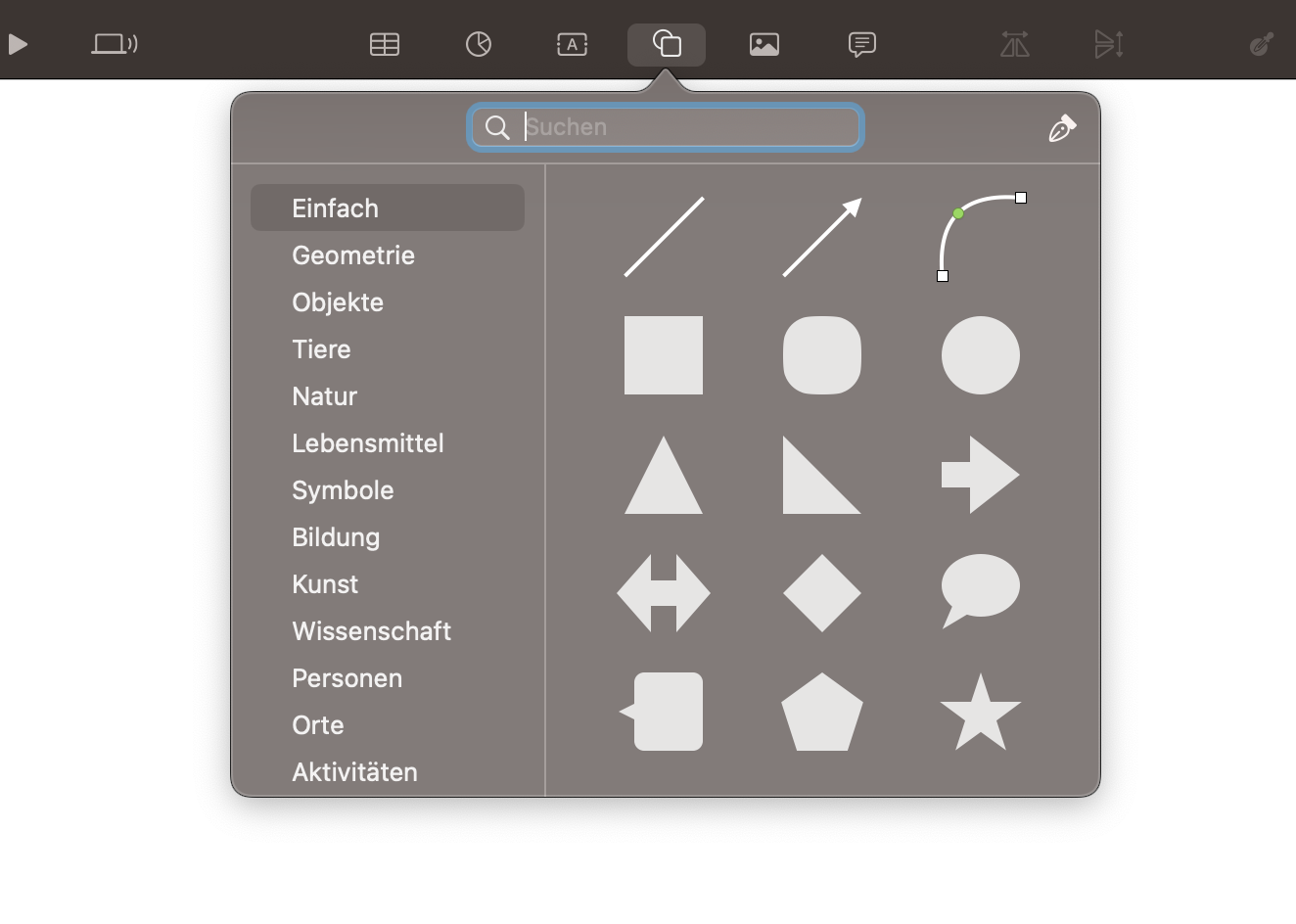
As a part of the anti-establishment myself—and for the foreseeable future, as they say, "stuck on the platform"—I am naturally interested in the slide-ware that comes pre-installed on my Mac; Apple Keynote. Keynote comes bundled with Numbers, a spreadsheet editor, and Pages, a word processor. As a trio, Keynote, Numbers, and Pages form 'iWork'—the office suite that comes pre-installed with every Mac. iWork has been exclusively available to Mac Users. But since 2013, iWork is available to everyone with an iCloud account. In 2017 Apple introduced the 'Shape Library' for iWork. It's a growing library of roughly a thousand outlines representing physical objects, concepts, or activities, meant to be used as a visual aid for presentations.
The library is accessed via a drop-down menu from which the user can drag and drop shapes into the current slide. Keynote stores those shape objects in a JSON file. JSON stands for JavaScript Object Notation. JavaScript is the programming language to breathe life into plain HTML and CSS websites. It's the tool for juicy user interaction—things like browser games, playback controls, or pop-up ads. Every time you drag and drop a shape into your presentation, a script (not a javascript) accesses this JSON file, locates the requested object, and inserts it into your document as an SVG; a scalable vector graphic.
Vectors
Unlike raster graphic formats—like JPEG or PNG—SVG is not based on a defined grid of pixels. An SVG is a constellation of points on a cartesian plane. The plane itself—as the name suggests—is scalable. Connect those points with lines and curves and you get a shape. Scaling a JPEG will reveal its given pixels. But an SVG will never turn fuzzy. The simpler a shape, the fewer coordinates are needed to express it. It’s possible to render a high fidelity, full-color image as an SVG, but by design SVG's afford abstraction. For example, The entire shape library with all of its 900+ icons and pictograms fits into a JSON file that takes up less than 10MB. Whether it is with geometric precision or as a cartoon, the SVGs in Apple's shape library and many other vector libraries, are usually abstracted to the most common characteristics of the things they represent.
In his 2007 essay On Compression, the artist Cory Arcangel gives an in-depth account of why JPEGs look the way they do. The reason for this is the DCT—Discrete Cosine Transform—the algorithm used in the lossy compression of JPEGs that is now basically all over the internet. But before going into details he briefly outlines how we got there: "If the ‘80s gave us ‘hot’ colors and ‘rad’ graphics, and the ‘90s gave us slick vector design, then the 00’s are giving us compressed blocky images. JPEGs are everywhere today because they have become a standard or a universally agreed upon set of rules."
I would argue then that, even though bandwidth dramatically increased since the 2000s; we must have been moving backward. The ‘10s still gave us compressed blocky images, but this time they helped shape alliances between comrades as Hito Steyerl argues in her defense of these poor images: "The circulation of poor images thus creates “visual bonds,” as Dziga Vertov once called them. This “visual bond” was, according to Vertov, supposed to link the workers of the world with each other." But from around 2015 onwards we got slick vector design, again. If the spirit of the early .net is the GIF and the spirit of the memeable web is a deep-fried JPEG, then the spirit of the corporate internet is an infinitely scalable vector graphic.
Tangents
In The Vectoralist Class McKenzie Wark describes the rise of a new class that no longer controlled land or industry but information itself. The first two, land and industry, have been separated from the third and like so formed a new kind of terrain sitting on top of the old. This new layer is still tied to the second nature of land and industry, but the information running on in the data centers can be easily edited. She argues that this "enables the landscape to be stretched, compressed, folded, and twisted into new shapes—at least for the purposes of economic activity."
Perhaps this is the reason why abstract vector illustrations have become—or still are—a tech company favorite alternative to stock photography. They scale with them. It's what Lukas Matsson means when he says: "I don't like real estate. It's not scalable." Houses are still bound to Warks' second nature. "When small projects can become big without changing the nature of the project, we call that design feature “scalability.”" writes Anna Lowenhaupt Tsing in On Nonscalability. She makes a case for why scalability has become such a defining feature of our world and why we need an alternative method for conceptualizing it.
But again, before talking about alternatives Tsing takes a look at the technological history that taught us how to go into detail. Computers allow us to zoom in and out of virtually anything. This is made possible by the stability of pixels, which according to Tsing "remain uniform, separate, and autonomous; they cannot bleed into each other or transform each other." From that, she derives the nonsoel (nonsocial landscape elements). Those elements are similarly isolated from each other, hence not able to form social relationships. The funny thing about pixels is that they take on a superposition. A pixel exists as the smallest addressable element of an image but at the same time, a pixel exists outside the operating system, as the smallest addressable element in a display. Tsing asks how we came to inhabit a world of nonsoels, and I would add: how has this world been conceptualized in vectors and rendered in pixels?
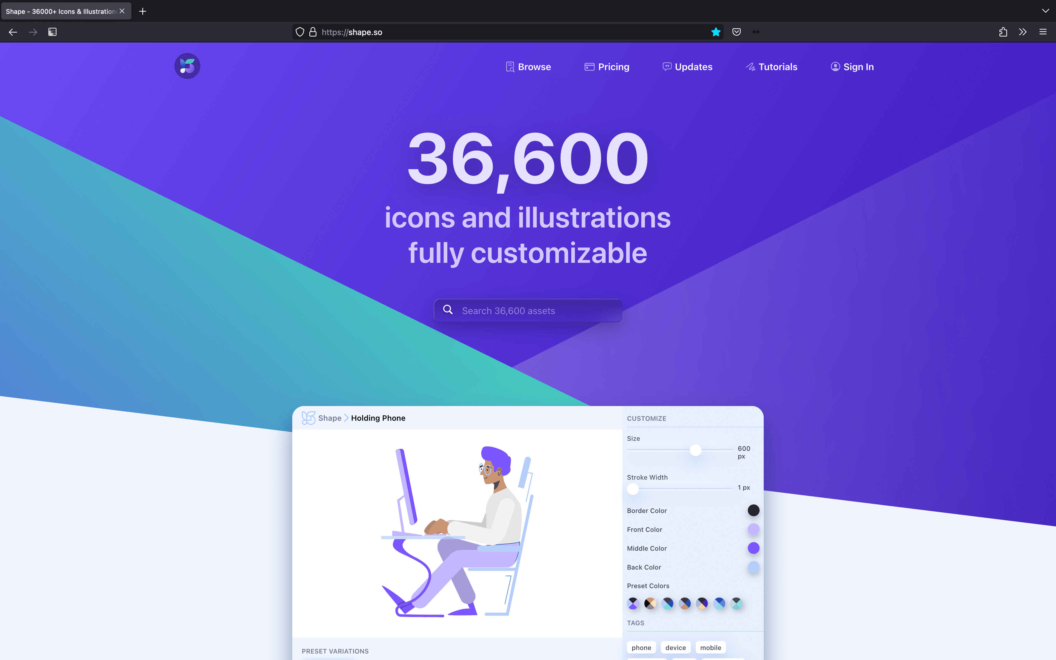
Even though SVGs are often enough exported as PNGs or JPEGs, they originate from vectors. Stock photos of smiling people still require models that are willing to glare into a camera. And once the photo is taken those pixels are difficult to edit. If someone decides to zoom in, they reveal their pixelated nature. But smiling outlines are void of any specificity by design, don’t involve models with skin, and are based on the same vectors that already make up the buttons, icons, and text in the rest of the user interface. Vectors are editable, have no resolution, no context, and no fidelity. Like universals, they are ‘repeatable or recurrent entities that can be instantiated or exemplified by many particular things’. That is, they are interchangeable and generic and like so ideal for addressing the largest possible audience, a global audience that itself has been flattened into numbers on a plane.
Scale
The Apple shape library is oddly emblematic of Apple as a company. No other piece of slide-ware features a clipart library that comes anywhere close to the one of Apple. PowerPoint, Open Office, and Google Slides all stay within the realm of basic shapes—circles, squares, triangles, stars arrows, and the occasional smiley. But the shapes within Apple's library strive for nothing less but an abstracted version of the entire universe. Already the sixteen categories that structure it, read like a timeline of events starting with the Big Bang and ending with Adolf Loos. And like the universe itself, this library is expanding.
- Basic
- Geometry
- Objects
- Animals
- Nature
- Food
- Symbols
- Education
- Arts
- Science
- People
- Places,
- Activities
- Transport
- Work
- Ornaments
The ur-system that predates all other modern pictorial languages is Isotype (International System of Typographic Picture Education). It was originally developed as the Vienna Method of Pictorial Statistics by Otto and Marie Neurath and designed by Gerd Arntz in the 1920s. After the Neuraths fled Austria from the Nazi's it was renamed to Isotype. The Neuraths believed that everyone should have access to knowledge and information, regardless of literacy or culture. In Otto's words: "Words divide, pictures unite". Isotype was designed to make that information universally accessible to everyone. So far so noble. Today it's preferably quoted as the forerunner to data visualization and infographics. And it's hard to imagine that whoever art directed the shapes for their library didn't take a long good look at the utopian vision that underpins Isotype before pitching it to their boss.
Something about the idea of a global visual language makes me a little uncomfortable. Luckily the chances that Apple Shape library or any other clipart library will replace the alphabet are still relatively low. And if you think about it, the alphabet also only consists of 26 highly abstracted pictograms, and historically speaking, those have been pretty sufficient to go into detail about almost anything. It's also not just the starry-eyed idealism that's packed into the idea that we would be better off speaking the same language or using the same tools. What's embedded into the idea of a global, international, or universal system is a notion of seamlessness.
In the case of the Apple shape library, the rationale is of course that users don't have to leave the software. The Apple Shape Library is emblematic of Apple's desire to create a seamless and integrated user experience across all of its devices and software. By providing a library of pre-designed graphics that can be easily added to presentations, documents, and spreadsheets, Apple is aiming to make it easier for users to create visually appealing content without having to leave their software environment. This is in line with Apple's broader strategy of creating a closed ecosystem of hardware and software that is tightly integrated and easy to use. No other company has mastered sameness as much as Apple did while simultaneously catering to a creative class that is so busy with selling the opposite.
The logical consequence here would be to repeat what Femke Snelting already wrote in 2007 in Awkward Gestures about designing with open source software: "Although a streamlined process might be faster, it runs the risk of everything looking the same in the end. Thus, in order to make your mark, a diversification of tools is necessary." And even though I love preaching to the choir, there is a part of me that wants to succumb to the Elysian dream that is Apple's UI.
I want to become like Steve. I want to take a shape from Apple's library, paste it onto my tongue and enter the hypercartesian presentation space that was promised to me in my last software update. I deserve to be a god. Only then can I form the world exactly as it should be. Rivers of ideas are flowing out of my hands and pooling into lakes of potential in front of a grand mountain range of linear argumentative narrative. The apple is the original sin. And my entire life I have only eaten apples. Now I can't imagine anything else.
In the opening lines to On Nonscalability Tsing wrote: "There is something disturbingly beautiful about precision, even when we know it fails us. A century ago, people stood awestruck at the terrible precision of the factory; today it is the precision of the computer." That's the scary thing. It's hard to imagine a world outside the current operating system. Striving for cohesiveness, focus, clarity, and precision has naturalized the idea that one needs to decide. Luckily you can still like multiple things, and often they are conflicting with each other.
